Arc
challenge
For years, Greendot Bank has pioneered embedded finance long before the term caught on. To compete with the key players in that field, they had to spin off their embedded knowledge into a sub-brand. It needed its own name, identity and voice. And, it had to feel different and yet not too far removed from the mother brand.
approach
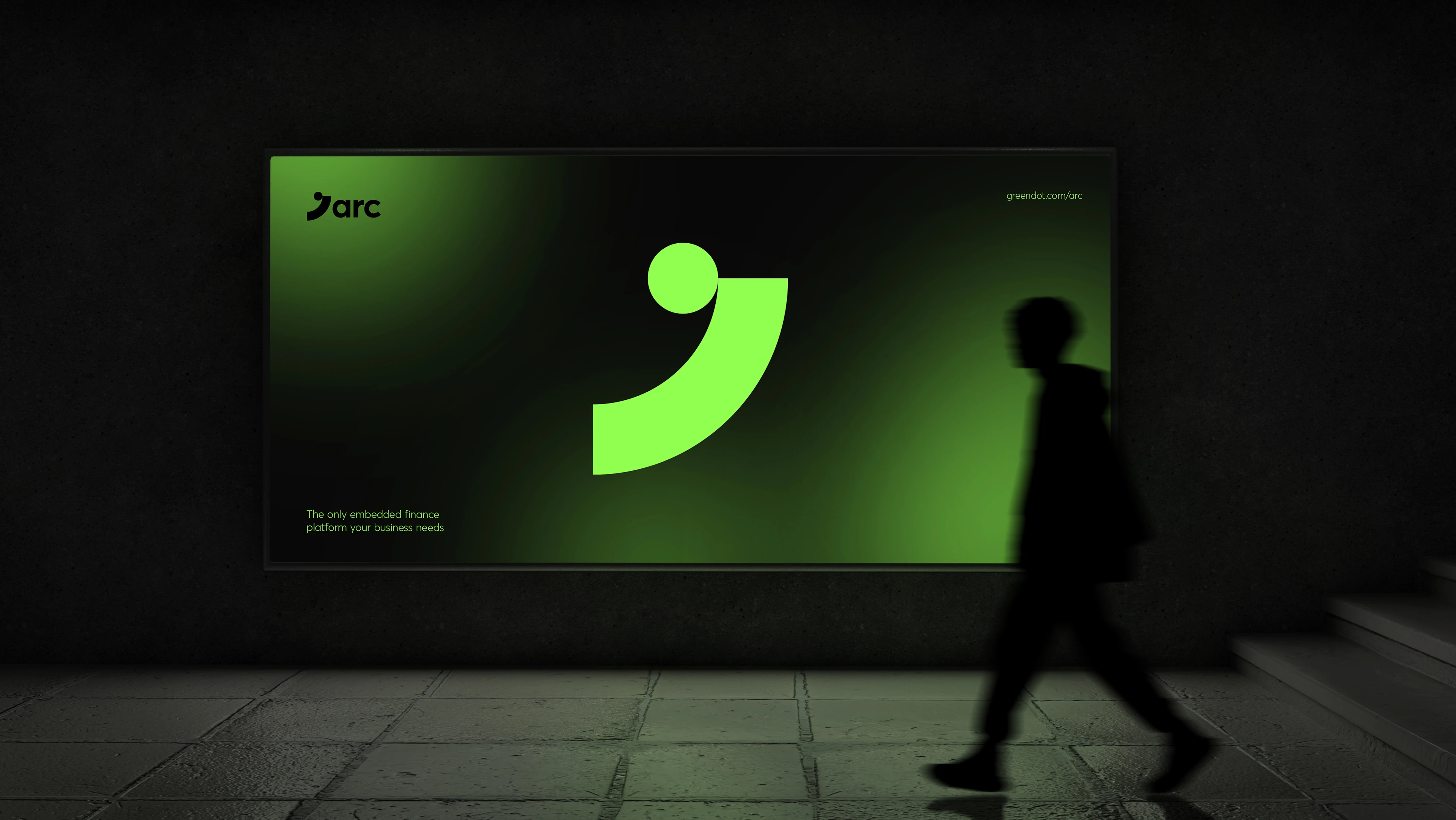
Arc became the name we settled on to represent the technology of ‘bridging’ connections between fintech money movement. Part of the identity shows a ‘dot’ - the main mark of the mother brand - subtly enough for most not to notice. The color palette of the final site stayed in the natural and green colors but many shades away from the Greendot brand. The end result is a delicate and super to-the-point site that makes it values clear and direct.
client
Green Dot Bank
services
Logo Design
Copywriting
Communications Strategy